Rebranding is often mistaken for a simple cosmetic update: a new logo, a fresh colour palette, or a modernised font. While visual identity is a crucial component, a truly successful rebrand is a fundamental strategic pivot. It’s a deliberate recalibration of a company’s entire identity to better align with its market, audience, and future ambitions. This process goes far beyond aesthetics, touching every aspect of the brand from its core messaging and tone of voice to its customer experience and market positioning.
The decision to rebrand is typically driven by critical business needs: adapting to market shifts, managing a reputation, expanding into new verticals, or simply reconnecting with a new generation of consumers. It's a calculated move to change perception and steer the business towards a more profitable and relevant future. In this article, we will dissect a curated collection of impactful rebranding examples, moving beyond the "before and after" to explore the strategic thinking behind each transformation. We will analyse the "why," the "how," and the measurable results, providing actionable takeaways for start-ups, SMBs, and established corporations, with a particular focus on the dynamic UAE market.
Understanding these case studies will equip you with a blueprint for evaluating your own brand. You will learn how to identify the right time to evolve and how to execute a rebrand that resonates with your target audience. A key part of execution is maintaining consistency post-launch. This is where a clear strategy for content creation becomes vital. Tools like Posterly, a direct product of Grassroots Creative Agency, can help your team streamline the creation of on-brand social media assets, ensuring your new identity is flawlessly represented across all digital touchpoints. Let’s explore the brands that got it right.
1. Airbnb's Logo Redesign and 'Bélo' Brand Evolution (2014)
In 2014, Airbnb transitioned from a functional accommodation booking platform to a global community-focused brand. The company replaced its original, somewhat generic blue script logo with a distinctive symbol called the 'Bélo', designed by the agency DesignStudio. This was more than a visual refresh; it was a strategic pivot to embody the core brand idea of "Belong Anywhere".
The 'Bélo' symbol was engineered to represent people, places, love, and the letter 'A' for Airbnb, all in one fluid mark. This comprehensive rebranding initiative aimed to create a deeper emotional connection with users, moving the narrative from simply finding a place to stay to experiencing a sense of belonging in a global community. The rollout was meticulously planned, with the new identity appearing simultaneously across its website, mobile apps, and marketing materials in over 190 countries, ensuring a consistent and impactful launch. This makes it one of the most studied rebranding examples for its strategic depth and execution.
Strategic Takeaways for Businesses
Anchor the Rebrand in a Core Idea: Airbnb didn't just design a new logo; they built a brand philosophy around "belonging". This central idea informed every aspect of the new identity, from the symbol's meaning to the tone of voice in their marketing. For businesses in the UAE, this means defining a brand purpose that resonates with a diverse, multicultural audience before considering visuals.
Prepare for a Global Rollout: The simultaneous launch across all channels and markets prevented brand fragmentation. This requires immense coordination but is crucial for global brands. A tool like Posterly can help manage and schedule social media content across different regions to ensure your new brand message is launched consistently.
Communicate the 'Why': Airbnb actively explained the meaning behind the 'Bélo' through blog posts and videos. This transparency helped manage public perception, turning a potentially controversial logo change into a conversation about community and connection, a valuable lesson for any company undergoing a significant brand evolution.
2. Old Spice's Digital Transformation Campaign (2010)
By 2010, Old Spice was widely perceived as a brand for an older generation. To revitalise its image, the company launched the "The Man Your Man Could Smell Like" campaign, led by the advertising agency Wieden+Kennedy. This wasn't just a new series of adverts; it was a full-scale digital-first rebranding that masterfully blended humour, charm, and unprecedented real-time social media engagement. The campaign shifted Old Spice's identity from dated to culturally relevant and highly desirable.

The initial advert went viral, but the true genius was the follow-up "Response Campaign". The actor, Isaiah Mustafa, created over 180 personalised video responses on YouTube to comments from fans, celebrities, and other brands on platforms like Twitter and Facebook. This execution showcased a deep understanding of the new digital landscape, leveraging user-generated conversation to fuel brand momentum. The campaign is a landmark case study in how a legacy brand can use creativity and digital savvy to connect with a completely new demographic, making it one of the most celebrated rebranding examples in modern advertising.
Strategic Takeaways for Businesses
Honour Heritage, But Don't Be Bound By It: Old Spice didn't abandon its name or history; it reinterpreted its masculine identity for a modern, digitally native audience. UAE businesses with a long history can similarly refresh their image by finding a new, contemporary way to tell their story without erasing their legacy.
Invest in High-Impact Creative Content: The campaign's success was built on a brilliant, witty, and highly shareable video concept. Quality production is key to cutting through the noise. Partnering with a skilled media production agency can help create content that is not only professional but also strategically designed to go viral.
Embrace Real-Time Engagement: Old Spice's willingness to engage in real-time, personalised conversations set a new standard for community management. Businesses should build social listening capabilities and empower their teams to interact authentically and spontaneously with their audience. Tools like Posterly can help manage and monitor social channels, but the human element of genuine interaction is what builds true brand loyalty.
3. Uber's App Icon and Brand Refinement (2016-2018)
Between 2016 and 2018, Uber undertook a significant brand refinement, moving away from its controversial "atom and bit" logo to a much simpler, wordmark-driven identity. This strategic shift was designed to unify its rapidly expanding ecosystem, which had grown beyond ride-sharing to include services like Uber Eats and Uber Freight. The goal was to create a cohesive and instantly recognisable brand architecture that could scale globally and accommodate future service lines.
Led by their internal design team and partners like Pentagram, the company adopted a clean, accessible logotype using a custom typeface, "Uber Move". This created a consistent visual foundation for all its sub-brands, such as Uber Eats, which uses the same wordmark with a distinct green colour. This evolution is a prime example of a brand simplifying its identity to achieve greater clarity and flexibility, making it one of the most analysed rebranding examples for platform-based businesses.
Strategic Takeaways for Businesses
Design a Flexible System, Not Just a Logo: Uber's new identity was a system built for growth. The core wordmark acts as a parent brand, allowing new services to be added seamlessly by changing colours or descriptors. Businesses in the UAE with ambitions to expand their service offerings should prioritise creating a flexible brand architecture that can evolve with them.
Prioritise Legibility and Recognition: The shift to a simple wordmark made the brand instantly recognisable across dozens of countries and languages, a crucial factor for a global app. This underscores the importance of testing new visual assets for clarity and recognition across different cultural contexts and digital platforms before a full rollout. For a deep dive into the process, explore our guide on rebranding a business.
Unify the Brand Experience: The consistent application of the "Uber Move" typeface and brand assets across the app, website, and marketing materials created a more coherent user journey. Whether ordering food or booking a ride, the customer experience feels unified. This consistency builds trust and reinforces the master brand's strength, a key lesson for any company managing multiple service lines.
4. Dunkin' Donuts to 'Dunkin'' Brand Simplification (2018)
In 2018, Dunkin' Donuts executed a significant rebrand by dropping "Donuts" from its name to become simply "Dunkin'". This move was a strategic reflection of a long-term business shift where over 60% of the company's sales already came from beverages, particularly coffee. The change aimed to reposition the brand as a beverage-led, on-the-go company that also sells food, rather than just a doughnut shop.
The rebrand, led by the brand’s global marketing team, involved more than just a name change. It included a modernised logo using the familiar rounded font and pink-and-orange colour palette, updated packaging that emphasised beverage prominence, and redesigned restaurant interiors to create a more contemporary experience. This pivot is one of the clearest rebranding examples of a company evolving its identity to match actual consumer behaviour and future growth strategy. The phased rollout across its stores and digital assets allowed the brand to manage the transition smoothly.
Strategic Takeaways for Businesses
Rebrand to Reflect Reality: Dunkin's change wasn't arbitrary; it was based on data showing customers primarily saw them as a beverage destination. Businesses, particularly in the UAE's fast-paced market, should use analytics to ensure their brand identity aligns with how customers actually perceive and use their products or services.
Plan a Phased and Coordinated Rollout: Dunkin' tested the new concept in select locations before a full-scale launch. This phased approach minimises risk and allows for adjustments. For managing the digital side of such a rollout, a tool like Posterly is invaluable for scheduling consistent social media updates across different platforms and regions, ensuring a unified brand message.
Train Internal Stakeholders: A key part of Dunkin's success was ensuring its vast network of franchisees understood and embraced the new direction. Developing a clear brand message strategy and providing comprehensive training for internal teams and partners is crucial for maintaining brand consistency at every customer touchpoint.
5. Facebook to Meta Rebrand and Metaverse Positioning (2021)
In late 2021, Facebook Inc. announced one of the most significant corporate rebrands of the digital era, changing its name to Meta Platforms Inc. This was not merely a cosmetic change but a fundamental strategic pivot to signal its future focus on building the metaverse. The move aimed to separate the parent company's identity from the Facebook app, which was facing intense public and regulatory scrutiny, and to reposition the organisation as a pioneer of the next digital frontier.
The rebrand was a deliberate effort to shift the narrative from social media to immersive virtual experiences. By adopting the Meta name and a new infinity-loop logo, the company sought to reframe its mission around building social technologies that connect people in new, virtual ways. The rollout involved a comprehensive overhaul of its corporate branding, investor communications, and public relations strategy, clearly delineating the parent company from its portfolio of apps like Facebook, Instagram, and WhatsApp. This high-stakes transformation is a masterclass in using a rebrand to signal a long-term vision, making it one of the most debated rebranding examples in recent history.
Strategic Takeaways for Businesses
Use a Rebrand to Signal a Strategic Pivot: Meta's change was driven by a clear, forward-looking business strategy: the metaverse. It wasn't just about escaping negative press; it was about claiming a future territory. For businesses in the UAE exploring new sectors like AI or sustainable tech, a corporate rebrand can powerfully signal this new direction to investors, talent, and customers.
Separate Corporate and Product Identities: By creating Meta as the parent brand, the company ring-fenced its corporate reputation from the day-to-day controversies affecting its individual social media apps. This structure allows product brands to maintain their unique identities while the corporate brand focuses on a broader vision. This is a crucial strategy for holding companies or businesses with diverse portfolios.
Develop a Robust Communication Plan: The rebrand was announced by Mark Zuckerberg in a detailed presentation, explaining the 'why' behind the change. This proactive communication is vital to manage perception and educate stakeholders. When launching a new brand identity, using a tool like Posterly to schedule and coordinate announcements across all social media channels ensures your message is consistent and reaches your entire audience simultaneously.
6. BMW's i-Series Electric Vehicle Brand Architecture (2011)
In 2011, facing the rise of the electric vehicle (EV) market, BMW executed a masterclass in brand architecture by launching 'BMW i' as a distinct sub-brand. Instead of integrating its new electric models, like the i3 and i8, into its main lineup, BMW created a separate identity. This strategic move allowed the company to innovate and target a new, environmentally conscious consumer without alienating its core audience, who valued the "Ultimate Driving Machine" performance heritage.
The 'BMW i' sub-brand was differentiated through a unique visual language, featuring blue accents and a focus on sustainable materials and futuristic design. The marketing narrative shifted from pure performance to "born electric," emphasising urban mobility and sustainability. This was supported by a unique customer journey, including specialised retail environments and digital experiences separate from the traditional BMW ecosystem. This initiative stands out among rebranding examples as a brilliant case of creating new market space while protecting and enhancing the parent brand’s equity.
Strategic Takeaways for Businesses
Use Sub-brands to Explore New Markets: BMW used the 'i' sub-brand to safely enter the EV market. This protected the core BMW brand from any potential risks associated with the new technology. For businesses in the UAE looking to diversify, creating a distinct sub-brand can be an effective way to test new products or services without diluting your primary brand identity.
Create a Distinct Customer Experience: The 'i' series had its own marketing, sales channels, and after-sales support. This holistic approach ensured the sub-brand’s unique value proposition was communicated at every touchpoint. Businesses should consider mapping out a complete and unique customer journey for any new sub-brand they launch.
Ensure the Sub-brand Reinforces the Parent: While distinct, the 'BMW i' brand still leveraged BMW's reputation for engineering, quality, and premium design. The sub-brand’s success ultimately reflected positively on the entire BMW Group. Ensure your sub-brand strategy is designed to complement and strengthen the parent company's overall brand portfolio, not compete with it.
7. Mozilla Firefox Logo Redesign and Brand Modernisation (2019)
In 2019, Mozilla undertook a significant brand evolution for its Firefox family of products. Moving beyond just the browser, the rebrand aimed to create a cohesive identity for its entire suite of privacy-focused services. The old, detailed fox logo was replaced with a simplified, modern icon system, designed to represent the master brand and individual products like Firefox Send and Firefox Monitor. This was a strategic shift to reinforce its position as a champion for user privacy and an open internet.
The new visual identity, developed with input from the open-source community, introduced a refreshed colour palette, new typography, and a geometric design language. The goal was not just to modernise the look but to create a flexible system that could scale across a growing ecosystem of tools. This initiative serves as one of the key rebranding examples of how to modernise an established tech brand while reinforcing its core mission, in this case, putting people's privacy first in an increasingly data-driven world.
Strategic Takeaways for Businesses
Evolve Recognisable Elements: Firefox didn't abandon its core imagery; it simplified the fox. For established brands, maintaining a thread of familiarity can prevent alienation of a loyal user base. This gradual evolution respects brand equity while signalling modernisation.
Build a Modular Design System: The rebrand wasn't for a single product but an entire family. By creating a modular system, Mozilla ensured consistency across all current and future applications. This is crucial for tech companies in markets like the UAE, where service offerings may expand rapidly to meet diverse customer needs.
Use the Rebrand to Articulate Your 'Why': Mozilla used the visual refresh as an opportunity to amplify its message about privacy and user empowerment. Businesses should treat a rebrand as a platform to clearly communicate their unique value proposition and differentiate themselves from competitors, a vital tactic in a crowded marketplace. A tool like Posterly can help schedule and deploy a coordinated social media campaign to share this refreshed brand story consistently.
8. Mastercard's Overlapping Circles Logo Evolution (2016)
In 2016, Mastercard undertook a significant brand evolution, simplifying its iconic intersecting circles and, for the first time in two decades, moving the brand name from within the symbol to sit alongside or below it. This change, orchestrated by design firm Pentagram, was a strategic move to future-proof the brand for an increasingly digital world. The goal was to create a flexible, optimised identity that worked seamlessly on everything from a tiny smartwatch screen to a massive billboard.
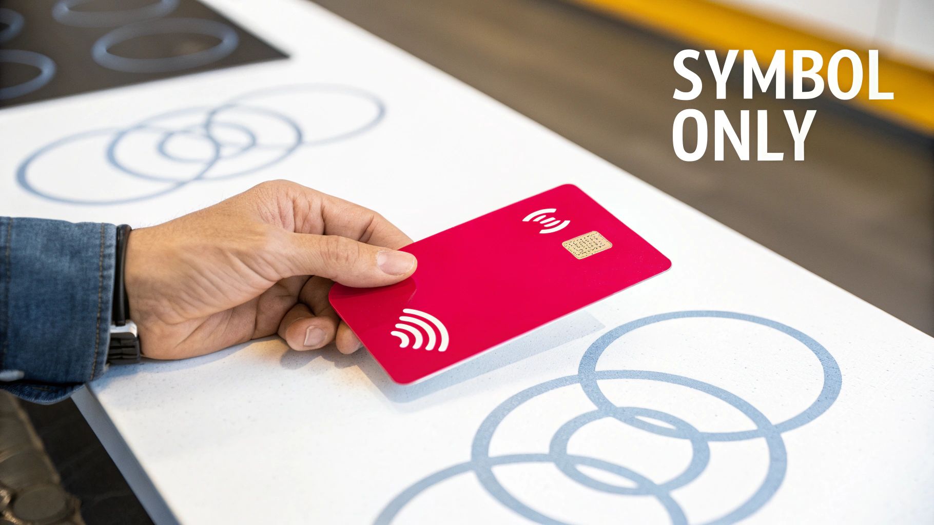
This simplification was not just an aesthetic update; it was a deliberate strategy to elevate the two circles into a standalone symbol, recognisable without the "Mastercard" wordmark. By 2019, the company took the final step and dropped the name entirely from its primary brand mark, confident that the symbol alone had achieved the status of globally recognised rebranding examples like Nike's swoosh or Apple's apple. This evolution underscored a shift from a credit card company to a comprehensive technology player in the global payments industry.
Strategic Takeaways for Businesses
Design for the Smallest Screen First: Mastercard’s rebrand prioritised digital applications. By ensuring the logo was clear and impactful on a watch face or mobile app icon, they guaranteed its effectiveness everywhere else. Businesses in the UAE should adopt this "mobile-first" design philosophy, as the region has one of the highest smartphone penetration rates globally.
Invest in Brand Awareness for a Symbol-Only Mark: Dropping the brand name is only possible after immense investment in brand recognition. Mastercard spent years reinforcing the connection between the circles and its name before making the final move. Use consistent, multi-channel campaigns to build this equity. Tools like Posterly can help schedule and manage social media content to ensure your brand's visual identity is consistently reinforced across all digital platforms.
Create Clear Usage Guidelines: A successful symbol-only system requires strict rules. Mastercard developed a comprehensive brand architecture defining when to use the symbol alone versus with the wordmark. This prevents brand dilution and ensures clarity. Your brand guidelines should be unambiguous, providing clear instructions for every possible application to maintain a strong, cohesive identity.
9. Slack's Logo Redesign and Brand Personality Evolution (2019)
In 2019, Slack, the collaboration hub that had become synonymous with start-up culture, undertook a major visual rebranding. The company retired its original, beloved but slightly complex, 11-colour hashtag logo (known as the octothorpe) for a cleaner, more geometric symbol. Designed in-house with Michael Bierut of Pentagram, the new logo was simpler, more scalable, and designed to work consistently across various backgrounds and applications, from tiny app icons to large billboards.
This was a strategic move to mature the brand's identity and position Slack as a reliable, enterprise-ready solution without losing its approachable personality. The rebrand involved a refined colour palette, new typography, and a comprehensive update to its product interface and marketing materials. This initiative demonstrated how a fast-growing company can evolve its visual identity to appeal to a broader corporate audience, making it one of the most discussed rebranding examples for balancing personality with professionalism.
Strategic Takeaways for Businesses
Evolve to Meet Your Market: Slack's original logo was perfect for its initial user base of tech start-ups. As the platform targeted larger enterprises, the rebrand signalled a new level of professionalism and stability. For businesses in the UAE looking to move from a start-up to a corporate client base, evolving the brand identity to reflect this maturity is crucial.
Prioritise Consistency and Scalability: A key driver for the change was the old logo’s inconsistency; it was difficult to use and often appeared incorrectly. The new system was designed for flawless application everywhere. This highlights the importance of creating a brand identity that is versatile and easy to implement across all touchpoints, from digital to physical.
Communicate Rebranding as an Evolution: Slack openly explained that the change was about refining its identity for the future, not abandoning its past. This transparent communication helped manage the transition for its loyal user community. When rebranding, it's vital to frame the change as a thoughtful evolution that better serves the customer's needs, which can be effectively communicated through coordinated social media campaigns managed with a tool like Posterly.
10. Toys 'R' Us Brand Evolution and Retail Experience Redesign (2018-2019)
Following its 2017 bankruptcy, Toys 'R' Us attempted a major comeback centred on revitalising its brand and retail experience. The goal was to pivot from a warehouse-style big-box retailer to an engaging, experiential destination for children and parents. The rebrand included a modernised logo featuring a star within the 'R', and new flagship stores designed around play, discovery, and interaction, incorporating virtual and augmented reality experiences. This effort was a critical attempt to address the core issues that led to its decline, mainly competition from e-commerce and a failure to evolve its in-store model.
The strategy focused heavily on creating "Instagrammable" moments and hands-on play areas, aiming to draw families back into physical stores. This initiative demonstrates a retail-centric rebranding approach, where the physical environment and customer experience become the primary vehicles for brand transformation. Although the initial comeback faced its own set of challenges, the focus on experiential retail provides a valuable case study, making it one of the more cautionary rebranding examples for businesses facing fundamental market shifts.
Strategic Takeaways for Businesses
Ensure Rebranding Addresses Core Business Issues: The Toys 'R' Us rebrand was creative but couldn't single-handedly solve deep-seated financial and operational problems. A new logo and fun stores are insufficient if pricing, supply chain, and e-commerce strategy are not competitive. Businesses in the UAE must ensure a brand refresh is supported by solid operational fundamentals.
Combine Brand Updates with Operational Efficiency: A successful rebrand must be more than cosmetic. It should be coupled with improvements in business processes. For Toys 'R' Us, this meant needing a more robust online-to-offline strategy and better inventory management to support the new experiential stores.
Use Phased Rollouts to Test and Learn: Instead of a massive, high-risk launch, testing new store concepts in key markets allows a business to gather data and refine its approach. A phased social media campaign, managed with a tool like Posterly, can help build excitement and measure audience response in specific regions before committing to a nationwide rollout. This iterative approach minimises risk and maximises the chance of success.
10 Rebranding Case Studies — Side-by-Side Comparison
| Example | Implementation Complexity (🔄) | Resource Requirements (⚡) | Expected Outcomes (⭐) | Ideal Use Cases (📊) | Key Advantages & Tips (💡) |
|---|---|---|---|---|---|
| Airbnb — Bélo (2014) | High — coordinated global rollout; design system creation | High — agency fees, asset updates, £200k estimate | Strong global recall and emotional connection; improved consistency | Start-ups scaling internationally; platform brands | Invest in comprehensive guidelines; communicate “why”; roll out across channels |
| Old Spice — Digital Campaign (2010) | Medium-high — continuous creative & real‑time social operations | High — video production, paid amplification, social team | Viral engagement, large audience lift; measurable sales increase (≈107%) | Legacy consumer brands pursuing digital-first repositioning | Use humour + authenticity; build social listening; combine paid + organic |
| Uber — App Icon & Refinement (2016–2018) | Medium — simplify mark and align sub‑brands | Moderate — design, education campaigns, product updates | Coherent multi-service identity; improved app clarity and scale | Multi-service platforms and product ecosystems | Design for flexibility; set sub‑brand rules; test recognition across markets |
| Dunkin' — Name Simplification (2018) | High — rename across 12,000+ locations, signage, packaging | High — store refit, packaging, training; phased rollout advised | Aligns brand with beverage-led revenue; modest same‑store lift (~+3%) | QSRs shifting category focus (menu/business model change) | Validate with data; phase rollout; train franchisees; monitor sentiment |
| Facebook → Meta (2021) | Very high — corporate renaming + strategic repositioning | Very high — tech investment, comms, investor relations (billions) | Reframes long‑term strategy; separates corporate vs. product risk; ROI uncertain | Large corporations pivoting strategy or consolidating portfolios | Align rebrand with clear narrative; communicate to all stakeholders; monitor perception |
| BMW i‑Series (2011) | High — new sub‑brand identity and separate customer journey | High — dedicated marketing, dealer experience, product design | Premium EV positioning; avoids diluting core brand; attracts new segments | Established brands entering new categories (tech/sustainability) | Define sub‑brand value; ensure distinct experiences; prevent cannibalisation |
| Mozilla Firefox (2019) | Medium — logo/system simplification across product ecosystem | Moderate — design system updates, UI refresh | Modernised perception; stronger “privacy first” positioning | Tech/digital brands modernising UX while keeping trust | Test with core users; retain recognisable elements; roll out gradually |
| Mastercard (2016) | Medium — symbol simplification and wordmark removal | Moderate — global asset changes, awareness campaigns | Symbol-only recognition optimised for mobile; timeless visual ID | Fintech and payment brands needing mobile-first marks | Design for smallest applications; test global recognition; clarify usage rules |
| Slack (2019) | Medium — mark modernisation + brand voice refinement | Moderate — product UI updates, marketing, design system revamp | Increased enterprise credibility while maintaining approachability | B2B SaaS scaling toward enterprise markets | Communicate as evolution; keep brand personality in voice; test with users |
| Toys 'R' Us (2018–2019) | High — experiential store redesign + digital integration | High — store builds, tech demos (VR/AR), marketing | Improved experience and buzz but limited ROI if core issues persist | Retailers pursuing experiential differentiation (after business review) | Assess fundamentals before heavy spend; phase pilots; pair with operational fixes |
Applying These Lessons to Your Next Brand Evolution
The journey through these ten diverse and impactful rebranding examples reveals a powerful truth: a successful rebrand is never just a cosmetic update. It is a strategic business manoeuvre, a calculated response to market shifts, consumer behaviour, and future ambitions. From Dunkin’s pivot to a beverage-led identity to Meta’s audacious leap into the metaverse, each case study underscores that the most effective brand evolutions are deeply rooted in a clear, forward-thinking strategy. They are not born from a desire for something "new" but from a critical need to better reflect what the business has become or where it is determined to go.
The common thread weaving through these stories is the crucial link between brand identity and business objectives. Whether it's Airbnb solidifying its community ethos with 'Bélo' or Old Spice completely revitalising its market perception to capture a new demographic, the visual and verbal changes were merely the external manifestation of a much deeper internal shift. These were not reactive decisions; they were proactive declarations of intent, meticulously planned and executed to solve specific business challenges.
Key Strategic Takeaways from These Rebranding Examples
As you consider your own brand's potential evolution, let these recurring themes guide your thinking. The success of the brands we’ve analysed was not accidental; it was built on a foundation of several core principles that you can adapt and apply to your own organisation, regardless of its size or industry.
Here are the most critical takeaways to internalise:
- Strategy Before Aesthetics: The most common pitfall is falling in love with a new logo or colour palette before defining the strategic 'why'. As seen with Mastercard and Slack, the visual changes were driven by a need for simplification, digital adaptability, and a clearer communication of their core value. Always start with your business goals, target audience analysis, and market position.
- Communicate the 'Why' Relentlessly: A rebrand can be jarring for loyal customers and employees. Airbnb faced initial backlash, but their clear communication about 'belonging' eventually won over their community. You must own the narrative. Proactively explain the reasons behind the change, the benefits it brings, and the vision for the future to all stakeholders, both internal and external.
- Evolution Over Revolution (Usually): Not every rebrand needs to be a radical overhaul like Facebook's shift to Meta. More often, a thoughtful evolution, like the refinements made by Mozilla Firefox or BMW, is more appropriate. This approach respects existing brand equity while signalling modernisation and progress, ensuring you don’t alienate your established customer base.
- Data, Not Just Instinct: Old Spice didn't just guess that humour would work; their campaign was built on deep insights into how purchasing decisions were being made. Use market research, customer surveys, focus groups, and performance analytics to validate your assumptions and guide your decisions. This is especially vital in a diverse market like the UAE, where cultural nuances can significantly impact perception.
Your Actionable Rebrand Checklist
Before you even brief a creative agency or sketch a single logo, your leadership team must be aligned. Use these questions as a starting point for your strategic discussions:
- The 'Why': Why are we considering a rebrand now? Have our mission, vision, or values fundamentally changed? Have we outgrown our current identity?
- The Goal: What specific business objective will this rebrand help us achieve? (e.g., enter a new market, attract a different demographic, increase market share by X%).
- The Audience: Who are we trying to connect with? Has our target audience evolved? What do they truly value, and how can our brand better reflect that?
- The Perception: What is our current brand perception, both internally and externally? What do we want it to be?
- The Rollout: How will we manage the transition across all touchpoints, from our website and social media to our physical assets and internal communications? Do we have the resources for a consistent launch?
Answering these questions honestly will provide the clarity needed to embark on a successful brand evolution. The rebranding examples we have explored demonstrate that a well-executed strategy can redefine a company’s trajectory, forging a stronger connection with its audience and paving the way for future growth. Your brand is your most valuable asset; evolving it thoughtfully is one of the most powerful strategic investments you can make.
Navigating the complexities of a rebrand requires a partner that blends strategic insight with creative execution. At Grassroots Creative Agency, we specialise in guiding businesses through this transformative process, ensuring your new brand identity is not only visually compelling but also perfectly aligned with your commercial goals. Let's build a brand that drives your business forward.