
Beyond the Logo: The Strategic Power of a Rebrand
In a competitive business environment, standing still means moving backward. A rebrand is often misconstrued as a simple cosmetic update—a new logo or a fresh color palette. But the most impactful transformations run much deeper. True rebranding is a strategic pivot, a fundamental realignment of a company's identity with its evolving vision, market position, and audience. It’s a declaration of where a brand is headed, not just where it has been.
This article moves beyond surface-level success stories to dissect the "why" and "how" behind some of the most pivotal rebranding examples in corporate history. We will analyze the market pressures that forced change, the strategic calculations behind each decision, and the tactical execution that turned vision into reality. Each case study serves as a masterclass in strategy, offering replicable methods and actionable takeaways for any business leader contemplating their own brand evolution.
Navigating this complex journey requires a blend of bold creativity and data-driven precision. By examining the journeys of giants like Apple, Google, and Starbucks, you will learn to identify the critical moments that demand change and the precise steps required for successful implementation. To see how other industries approach these challenges, these additional rebranding examples offer further valuable insights. This analysis will provide a blueprint that demystifies the process, showing how a well-executed shift can redefine a company's trajectory and secure its future relevance.
1. Apple Computer to Apple Inc.
In early 2007, Steve Jobs took the stage and announced a change that seemed subtle but was, in fact, seismic: Apple Computer, Inc. would henceforth be known simply as Apple Inc. This masterful move is one of the most cited rebranding examples because it wasn't just a cosmetic update; it was a public declaration of a new, expansive corporate strategy. The change perfectly encapsulated the company's evolution from a niche personal computer manufacturer to a dominant force in the broader consumer electronics and digital services industries.
The Strategic Pivot: Beyond the Desktop
The timing of this rebrand was no accident. It was announced at the same Macworld conference where Jobs unveiled the very first iPhone, a device that would redefine mobile technology. By dropping "Computer" from its name, Apple signaled to the world and its investors that its future was not confined to the desktop. This linguistic pivot was a strategic masterstroke that gave the brand permission to conquer new territories.
This foresight proved incredibly accurate. The name change set the stage for the successful launch of the iPad in 2010, the Apple Watch in 2015, and the explosive growth of its Services division, which now includes the App Store, Apple Music, iCloud, and Apple TV+. Had the company remained "Apple Computer," these category-defining products might have felt like strange deviations from a core mission. Instead, under the "Apple Inc." banner, they felt like natural, exciting extensions of a unified ecosystem.
Key Takeaways and Actionable Insights
Apple's rebrand offers a powerful blueprint for any business, from startups in Dubai to established global corporations, looking to navigate a strategic pivot. The success was rooted in a few key principles that can be adapted and applied.
-
Align Rebranding with a Major Catalyst: Apple tied its name change to a revolutionary product launch. This immediately gave the new brand identity a powerful, positive association with innovation and the future. Actionable Tip: If you're planning a rebrand, tie it to a new product, a significant service update, or a major company milestone to generate momentum and provide clear context for your audience.
-
Evolve Your Identity, Don't Erase It: While the name changed, the iconic Apple logo and the company's core values of design excellence and user-friendliness remained firmly in place. This preserved brand equity and reassured a loyal customer base. By doing so, the company effectively managed its brand reputation during a period of significant change.
-
Ensure Your Brand Reflects Your Vision: The name "Apple Inc." is purposefully broad, creating a flexible foundation for decades of future growth. It doesn't limit the company to a single product category. Actionable Tip: When choosing or changing a brand name, think about your 10-year vision, not just your current product line. The execution of such a wide-reaching strategy is a case study in itself. To delve deeper into effective strategies, consider exploring how ad360 achieved top vCPM in branding campaigns.
2. Google to Alphabet Inc.
In August 2015, Google announced a monumental corporate restructuring that stands as one of the most sophisticated rebranding examples in modern business. The company didn't just change its name; it fundamentally reconfigured its entire operational structure by creating a new parent company, Alphabet Inc. This was not a rebrand aimed at consumers, who would still "Google" things as always. Instead, it was a strategic masterstroke designed to provide clarity, focus, and accountability across a rapidly diversifying portfolio of ventures.
This new corporate structure is best understood as a clear hierarchy, separating the established, profitable core from the ambitious moonshot projects.
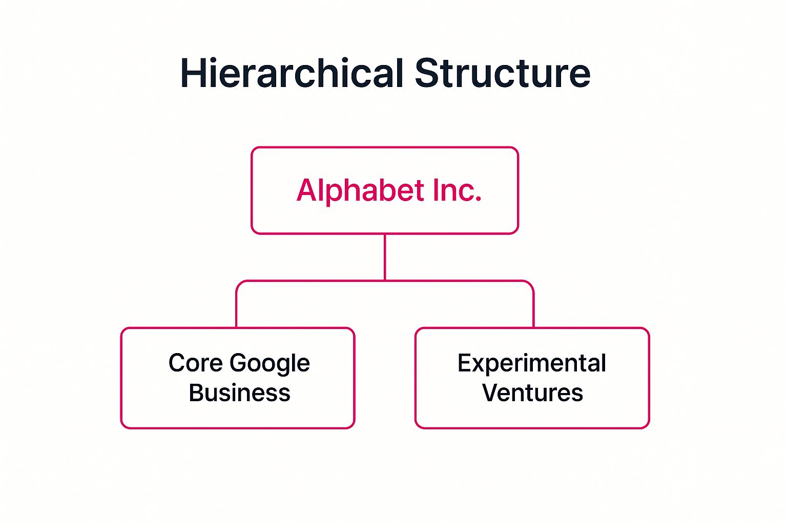
This visualization highlights the strategic decision to insulate the stable Google search and ads business from the financial risks and different operational needs of its speculative 'Other Bets'.
The Strategic Pivot: Clarity and Focus
Prior to 2015, Google was becoming a complex and opaque monolith. Its core search, ads, and Android businesses were bundled with wildly ambitious, long-term projects like self-driving cars (Waymo), life sciences research (Verily), and smart home technology (Nest). This structure made it difficult for investors to accurately assess the financial health of the core business versus the high-spend, speculative ventures. It also created a culture where these "Other Bets" were seen as expensive hobbies rather than serious, standalone businesses.
The creation of Alphabet solved this brilliantly. The highly profitable Google unit, led by a new CEO, Sundar Pichai, could focus entirely on its core mission. Meanwhile, the other ventures were spun out as independent companies under the Alphabet umbrella, each with its own CEO and a mandate to achieve its own long-term vision. This gave ventures like Waymo and Wing (drone delivery) the autonomy to operate like focused startups while still having the backing of a well-capitalized parent.
Key Takeaways and Actionable Insights
The Alphabet restructure offers a powerful lesson in corporate organization for companies experiencing rapid diversification. The principles behind it can be scaled to fit businesses in any market, including the dynamic landscape of the UAE, where conglomerates often manage diverse interests.
-
Protect Your Cash Cow: The Google brand itself, the source of immense profit and consumer trust, was left untouched and even strengthened by being more focused. The rebrand happened at the corporate level, shielding the consumer-facing brand from the risks of experimental ventures. Actionable Tip: If your business is expanding into riskier or unrelated fields, create a parent holding company. This allows you to protect the brand equity and financial stability of your core business while giving new ventures room to grow or fail without damaging the primary brand.
-
Structure for Transparency and Accountability: The main audience for this rebrand was Wall Street and internal leadership. The new structure provided unprecedented financial transparency, allowing investors to see exactly how the core Google business was performing separately from the "Other Bets." Actionable Tip: When your company grows in complexity, ensure your structure provides clarity to key stakeholders. Separate P&Ls and distinct leadership for different business units can attract investment and empower managers by giving them clear ownership and measurable goals.
-
Empower Ventures with Focused Leadership: Each Alphabet company, from Verily to Waymo, has its own CEO. This decentralizes leadership and allows each business to develop a culture and operational model best suited to its specific industry, whether it's healthcare tech or autonomous logistics. Actionable Tip: Avoid a one-size-fits-all management approach. As you diversify, install dedicated leaders for each new venture who have the autonomy to make decisions, build their own teams, and be held accountable for their specific results.
3. Facebook to Meta
In late 2021, Mark Zuckerberg announced one of the most audacious and closely watched corporate rebrands in recent memory: the parent company Facebook, Inc. would become Meta Platforms, Inc. This was far more than a name change designed to distance the company from its social media controversies. It was a monumental declaration of a new guiding mission, pivoting the entire organization toward building the metaverse, what it sees as the next frontier of digital interaction.

The Strategic Pivot: Building the Metaverse
The rebrand from Facebook to Meta was a strategic move to redefine the company's core identity and future trajectory. By elevating "Meta" to the parent level, the company signaled that its namesake app, Facebook, was now just one of many products under a broader umbrella, alongside Instagram and WhatsApp. The primary goal was to establish the company as the unequivocal leader in building the next-generation internet, an immersive and embodied experience where virtual and augmented reality converge.
This pivot wasn't just a narrative shift; it was backed by colossal financial and technological commitments. The company funneled billions of dollars into its Reality Labs division, responsible for developing the hardware and software for the metaverse. This included advancing its Oculus VR headsets (rebranded to Meta Quest) and launching platforms like Horizon Worlds, a social VR space. Partnerships, such as the one with Ray-Ban for smart glasses, served as early, tangible steps toward integrating this technology into everyday life, making this one of the most ambitious rebranding examples to date.
Key Takeaways and Actionable Insights
Meta's bold rebrand provides crucial lessons for companies in the UAE and beyond considering a fundamental shift in their corporate identity. The execution, while met with skepticism, was rooted in clear strategic principles.
-
Preserve Core Brand Equity: Meta wisely kept the names of its cash-cow applications like Facebook, Instagram, and WhatsApp. This prevented mass user confusion and protected the immense brand equity these platforms had built over years. Actionable Tip: When rebranding a parent company, allow successful sub-brands to maintain their established identities. This provides a stable foundation and revenue stream during the transition.
-
Back Your New Vision with Massive Action: The Meta name would have been empty without the multi-billion dollar annual investment in Reality Labs. The commitment was made real through tangible resource allocation. Actionable Tip: A new brand name is a promise. Demonstrate your commitment by making significant, visible investments in the technology, talent, and infrastructure required to make your new vision a reality.
-
Clearly Articulate a Long-Term Narrative: The rebrand was announced via a detailed, hour-long presentation that laid out the vision for the next decade. This is a critical component of successful brand positioning strategies. Actionable Tip: Don't just announce a new name; sell a new story. Create a compelling narrative that explains the "why" behind the change to rally employees, investors, and customers around a shared future.
-
Prepare for Skepticism and Play the Long Game: The shift to Meta was met with significant doubt from the market and the public. The company understood this and prepared for a long, capital-intensive journey. Actionable Tip: If your rebrand represents a major, forward-looking pivot, anticipate pushback. Be prepared to withstand initial criticism and focus on delivering incremental progress over years, not just months.
4. Kentucky Fried Chicken to KFC
In 1991, one of the world's most recognizable food chains made a monumental decision: Kentucky Fried Chicken would officially become KFC. This was far more than a simple abbreviation; it was a calculated and strategic response to a significant shift in public consciousness. As consumers became increasingly health-aware, the word "Fried" in the brand's name transformed from a descriptor into a liability. This pivot stands as one of the most referenced rebranding examples, demonstrating how a legacy brand can proactively adapt to evolving cultural values.
The Strategic Pivot: Shifting Away from 'Fried'
The move to KFC was a masterclass in perception management. By the early 1990s, low-fat diets were gaining mainstream popularity, and the negative health connotations of fried food were impossible to ignore. The brand's full name was actively working against its efforts to be seen as offering more than a single, indulgent product. The abbreviation allowed the company to subtly distance itself from the "fried" perception without abandoning the immense brand equity built over decades.
This name change was not an empty marketing gesture; it was underpinned by a fundamental evolution in their menu strategy. The new, more flexible "KFC" banner gave the brand license to innovate and diversify its offerings. This paved the way for the successful introduction of non-fried items, such as their grilled chicken line, as well as healthier sides and salads. The rebrand signaled to customers that KFC was evolving and listening to their changing preferences, effectively modernizing its image for a new generation.
Key Takeaways and Actionable Insights
KFC's transition offers a powerful case study for any business, particularly those in the F&B or CPG sectors, whose product or name may face changing public sentiment. The success of this rebrand highlights several key strategies that businesses in the UAE and beyond can learn from.
-
Evolve Proactively, Not Reactively: KFC saw the trend of health consciousness growing and acted before the "fried" association became a critical threat to its market share. They didn't wait for a crisis. Actionable Tip: Continuously monitor cultural and consumer trends relevant to your industry. Plan a brand evolution before negative sentiment can significantly damage your reputation or sales.
-
Ensure the Rebrand is Backed by Substance: The switch to KFC would have seemed disingenuous if the menu hadn't also evolved. The launch of grilled chicken and other healthier options proved the rebrand was a genuine commitment to change. Actionable Tip: A rebrand must be more than cosmetic. Align your new brand identity with tangible improvements or changes in your products, services, or customer experience to build trust.
-
Preserve Core Brand Assets: While the name changed, KFC wisely retained its most powerful and recognizable assets: the iconic Colonel Sanders logo and the signature red-and-white color scheme. This maintained a crucial link to their heritage and ensured continued brand recognition. Actionable Tip: Before rebranding, conduct an audit of your brand assets. Identify the core elements that hold the most equity with your audience and find ways to preserve or modernize them, rather than discarding them completely.
5. Starbucks Coffee to Starbucks
In 2011, Starbucks made a bold move that sent ripples through the branding world: it dropped both "Coffee" and its own name from its iconic circular logo, leaving only the siren. This change was far more than a simple design refresh. It was a clear and powerful signal of the company's evolution from a coffee house into a global consumer brand and a lifestyle "third place" between home and work. This is one of the most studied rebranding examples because it demonstrates how to leverage immense brand equity to break free from a successful but limiting category.
The Strategic Pivot: Beyond the Bean
By removing "Coffee" from its primary visual identity, Starbucks gave itself the freedom to aggressively expand its product lines without creating brand confusion. The name had become a constraint. The company's vision, driven by Howard Schultz, was to offer a much wider array of products. This rebrand was the strategic key that unlocked the door to selling everything from Teavana teas and high-end bakery items to a massive line of consumer-packaged goods found in grocery stores worldwide.
This foresight enabled the brand to become a major player in multiple categories. The simplified, wordless logo worked seamlessly on VIA Ready Brew packets, K-Cup pods, and bottled Frappuccinos on supermarket shelves. It also supported the massive expansion of its digital ecosystem, including the Starbucks Rewards program and mobile app, cementing the brand as an experience rather than just a product. The siren became a universal symbol for a premium, convenient experience, whether the customer was buying a latte, a sandwich, or a bag of potato chips.
Key Takeaways and Actionable Insights
Starbucks' masterclass in brand evolution provides critical lessons for any business, especially those in the competitive F&B and retail sectors in markets like the UAE, looking to expand their horizons. The success was built on strategic courage and a deep understanding of its own brand power.
-
Simplify to Amplify: Starbucks recognized that its siren logo had become so iconic that the words were redundant. By removing them, the siren became even more powerful and versatile. Actionable Tip: Conduct brand recognition research. If a specific visual element of your brand has near-universal recognition with your target audience, consider if other elements can be simplified to increase its impact and flexibility across different platforms and products.
-
Let Your Brand Evolve with Your Business: The rebrand wasn't done in a vacuum; it was a direct reflection of a new business strategy focused on diversification. The new identity was created to serve the future of the business, not just its past.
-
Leverage Brand Equity for New Ventures: The trust and premium perception associated with the Starbucks siren were transferred to new product lines like food and tea. This gave them an immediate advantage over competitors. Actionable Tip: Before launching a new product line, assess how your current brand identity can lend credibility. Use the rebrand as an opportunity to formally communicate this expansion and transfer that positive brand association to your new offerings.
6. Dunkin' Donuts to Dunkin'
In 2018, the beloved American chain Dunkin' Donuts officially shortened its name to simply "Dunkin'." This was far more than a stylistic trim; it was a calculated strategic repositioning to reflect a fundamental shift in its business. The move is a prime case study among rebranding examples because it successfully aligned the brand's public identity with its primary revenue stream, cementing its status as a major player in the fast-paced, beverage-led market.
The Strategic Pivot: Brewing a Beverage-First Identity
The decision to drop "Donuts" was driven by hard data: by 2018, beverages accounted for a staggering 60% of the company's U.S. sales. The old name, while iconic, created a perception that was misaligned with the reality of consumer behavior. The rebrand was a direct and bold declaration that Dunkin' was a beverage-first company, aiming to compete more fiercely with coffee-centric giants like Starbucks and cater to the modern, on-the-go consumer.
This strategic shift was not just communicated through a new logo; it was executed through tangible operational changes. The company invested heavily in its beverage offerings, expanding its espresso-based drink menu and promoting high-growth products like Cold Brew coffee. Simultaneously, Dunkin' rolled out its "Next Generation" store designs, which featured modern aesthetics, streamlined layouts, and prominent tap systems for cold drinks. Crucially, these new stores emphasized convenience with dedicated mobile order pickup areas, directly supporting the "on-the-go" brand promise.
Key Takeaways and Actionable Insights
Dunkin's transformation from a donut shop to a beverage powerhouse offers a pragmatic playbook for any business, including those in the fast-moving markets of the UAE, looking to pivot based on market realities. Its success was built on several key principles.
-
Let Data Drive Your Brand Story: Dunkin's rebrand wasn't based on a whim but on clear sales data showing where its growth was. The new name simply caught up to what was already happening. Actionable Tip: Conduct a thorough analysis of your revenue streams. If a significant portion of your business comes from a service or product not reflected in your branding, it may be time to re-evaluate your public identity.
-
Support Rebranding with Operational Reality: The name change would have felt hollow without the investment in better coffee machines, new drink menus, and faster service models like mobile ordering. The experience validated the new brand promise. Actionable Tip: A rebrand must be more than a new logo. Map out the entire customer journey and identify operational upgrades, from staff training to technology adoption, that will bring your new brand identity to life.
-
Evolve Without Erasing Your Heritage: While "Donuts" was dropped from the name, the brand wisely retained its iconic and playful pink-and-orange color palette and its familiar, rounded font. This maintained decades of brand equity and ensured customers still felt connected to the brand they loved. Actionable Tip: Identify your core, non-negotiable brand assets. During a rebrand, these elements can provide a crucial bridge of familiarity for your loyal customers, making the change feel like a natural evolution rather than a complete replacement.
7. Airbnb Logo and Brand Redesign
In 2014, Airbnb underwent a radical transformation that became one of the most discussed rebranding examples of the decade. Moving far beyond its functional roots of offering "air beds and breakfasts," the company, under the leadership of Brian Chesky, Joe Gebbia, and Nathan Blecharczyk, introduced a new philosophy and visual identity. The launch of the 'Bélo' symbol was more than a logo change; it was a strategic repositioning of the entire company from a simple booking platform to a global community built on the powerful idea of "Belong Anywhere."

The Strategic Shift: From Air Mattress to Belonging
The rebrand was a direct response to Airbnb's maturation as a company. The original branding felt temporary and transactional, failing to capture the rich, unique experiences users were having. The strategic goal was to build an emotional connection and establish a brand that could house a much larger vision. The 'Bélo' logo was designed to be a universal symbol representing people, places, love, and the 'A' for Airbnb, encapsulating the core mission of belonging.
This new brand narrative gave Airbnb the foundation to expand its offerings significantly. It was no longer just about a place to stay; it was about the entire travel experience. This pivot paved the way for the successful launch of "Airbnb Experiences," allowing hosts to offer unique activities, tours, and workshops. The rebrand provided a cohesive identity that unified accommodation, activities, and a global community under a single, emotionally resonant mission, justifying its place as a top-tier rebranding case study.
Key Takeaways and Actionable Insights
Airbnb’s transformation provides a clear roadmap for service-based businesses in the UAE and beyond looking to build a brand with deep emotional equity. The success was not accidental but the result of a deliberate, user-centric strategy.
-
Ground Your Brand in a Powerful Human Emotion: Airbnb tapped into the universal human desire for belonging. This elevated the brand from a utility to a community with a shared purpose. Actionable Tip: Instead of focusing only on your product's features, identify the core emotion your service provides to your customers and build your brand story around that feeling.
-
Prepare For and Manage the Initial Backlash: The 'Bélo' logo was met with initial ridicule and parody online. However, Airbnb had a strong communications plan. They confidently explained the logo's meaning and stood by their vision, and eventually, the narrative took hold. Actionable Tip: When launching a bold rebrand, anticipate criticism. Prepare a clear and compelling story to explain the "why" behind the change and manage the conversation proactively.
-
Ensure Brand Identity is Reflected Everywhere: The rebrand was successful because it was holistic. The new philosophy was integrated into every touchpoint, from the app's user interface to host communication. Comprehensive website branding is essential to ensure that this new identity is consistently and effectively communicated across all digital platforms.
Rebranding Examples: Before & After Comparison
| Rebrand Example | Implementation Complexity 🔄 | Resource Requirements ⚡ | Expected Outcomes 📊 | Ideal Use Cases 💡 | Key Advantages ⭐ |
|---|---|---|---|---|---|
| Apple Computer to Apple Inc. | Moderate – Coordinated launch timing and marketing | High – Significant marketing and product development | Expanded brand into diversified tech, ecosystem approach | Companies expanding product range beyond original niche | Flexible brand reflecting innovation and market expansion |
| Google to Alphabet Inc. | High – Complex holding company restructuring | High – Administrative, compliance, multiple subsidiaries | Clear financial transparency, independent ventures | Organizations managing diverse, unrelated business units | Improved investor clarity and focused leadership |
| Facebook to Meta | High – Brand overhaul with new identity and tech investment | Very High – Large investment in VR/AR and new tech | Positioning as metaverse leader, long-term vision | Firms pivoting to futuristic markets and tech innovation | Distances from past controversies, attracts new talent |
| Kentucky Fried Chicken to KFC | Low to Moderate – Name shortening and marketing update | Moderate – Marketing plus menu and design changes | Improved health image, menu diversification | Legacy brands seeking modernization and health-conscious appeal | Simplifies brand name, appeals to wider demographics |
| Starbucks Coffee to Starbucks | Moderate – Logo simplification and brand repositioning | Moderate – Marketing and product portfolio expansion | Broader product line beyond coffee, premium positioning | Brands expanding offerings while maintaining legacy appeal | Simplified identity supporting global and digital growth |
| Dunkin' Donuts to Dunkin' | Moderate – Name change with updated visuals and store redesigns | Moderate – Marketing, franchisee support, store updates | Emphasizes beverage focus, competes with coffee leaders | Brands shifting core offerings to align with sales trends | Efficient marketing with clarified product focus |
| Airbnb Logo and Brand Redesign | Moderate – New identity with extensive education needed | Moderate – Design, communication, global rollout | Emotional connection, community focus, global scaling | Platforms evolving brand story and community engagement | Unique symbol promoting belonging and differentiation |
Your Blueprint for a Successful Brand Transformation
The journey through these iconic rebranding examples reveals a powerful, unifying truth: a successful rebrand is never just a cosmetic facelift. It is a strategic declaration of intent. From Apple shedding its "Computer" label to embrace a universe of consumer electronics, to Dunkin' dropping "Donuts" to own the on-the-go beverage market, each transformation was a calculated move rooted in deep market insight and a clear vision for the future.
These case studies are more than just interesting stories; they are blueprints packed with replicable strategies. They show us that a brand is not a static logo but a dynamic entity that must evolve to survive and thrive. Ignoring the need for change is a risk far greater than the change itself.
Synthesizing the Core Principles of Effective Rebranding
Distilling the lessons from giants like Meta, Starbucks, and KFC, we can identify several foundational principles that underpin any successful brand evolution. These are the non-negotiables for any business, from a startup in Dubai to an established global corporation, considering a new identity.
- Strategy Before Aesthetics: The most common mistake is starting with the logo. As Google's transition to Alphabet demonstrated, the most powerful rebrands begin with a fundamental business strategy. The new structure demanded a new identity, not the other way around. Your "why" must always precede your "what."
- The Power of Calculated Subtraction: What you remove is often more important than what you add. Kentucky Fried Chicken became KFC to downplay "fried." Starbucks removed "Coffee" to signify a broader experience. This act of simplification broadens market appeal and allows the brand to transcend its original product category.
- Leverage Your Core Equity: A rebrand doesn't mean erasing your history. Dunkin' kept its iconic pink and orange colors and friendly font. Starbucks kept its Siren. Successful brands identify the core visual and emotional assets that resonate with their loyal customers and build the new identity around them.
- Master the Narrative: A new brand is a story you tell your customers, employees, and investors. Airbnb faced initial backlash over its "Bélo" logo but stood firm, explaining the narrative of belonging. Meta invested billions in communicating its pivot to the metaverse. You must own the conversation and proactively explain the purpose and benefits of the change with absolute clarity.
Your Actionable Rebranding Checklist
Moving from theory to action requires a structured approach. Before you engage a designer or write a press release, use this checklist to lay the groundwork for a transformation that drives real business results.
- Conduct a Rigorous Brand Audit: Start with an honest internal assessment. Why are you considering a rebrand? Is your brand misaligned with your mission? Have you outgrown your name? Are you failing to connect with a new target audience? Quantify the problems you are trying to solve.
- Immerse Yourself in Audience Insight: Your perception of your brand is secondary to your customers' perception. Use surveys, focus groups, and social listening to understand what your brand means to them today. This data is the raw material for building a new identity that resonates.
- Map Your Competitive Landscape: Analyze how your direct and indirect competitors are positioned. Where are the gaps in the market? A rebrand offers a unique opportunity to reposition your business, claim a new niche, and create clear differentiation that gives you a competitive edge.
- Plan a Meticulous Rollout: The launch is not a single event but a phased campaign. Plan every touchpoint, from your website favicon and social media profiles to your email signatures and physical packaging. A consistent and seamless rollout builds confidence and minimizes confusion.
Ultimately, the most compelling rebranding examples show us that a brand transformation is an investment in future growth. It is an opportunity to re-energize your team, recapture market attention, and build a more resilient, relevant, and profitable business for the years to come. It's a bold declaration that your company's future will be even more exciting than its past.
Embarking on this journey requires not only a clear vision but also an expert partner to translate that vision into a compelling brand identity and a flawless execution plan. Grassroots Creative Agency specializes in providing the strategic framework and creative firepower needed to navigate this complex process, ensuring your rebrand drives tangible results. Let's build your brand's future, together.